- Work
- MoovPay Website
MoovPay Website

MoovPay Website
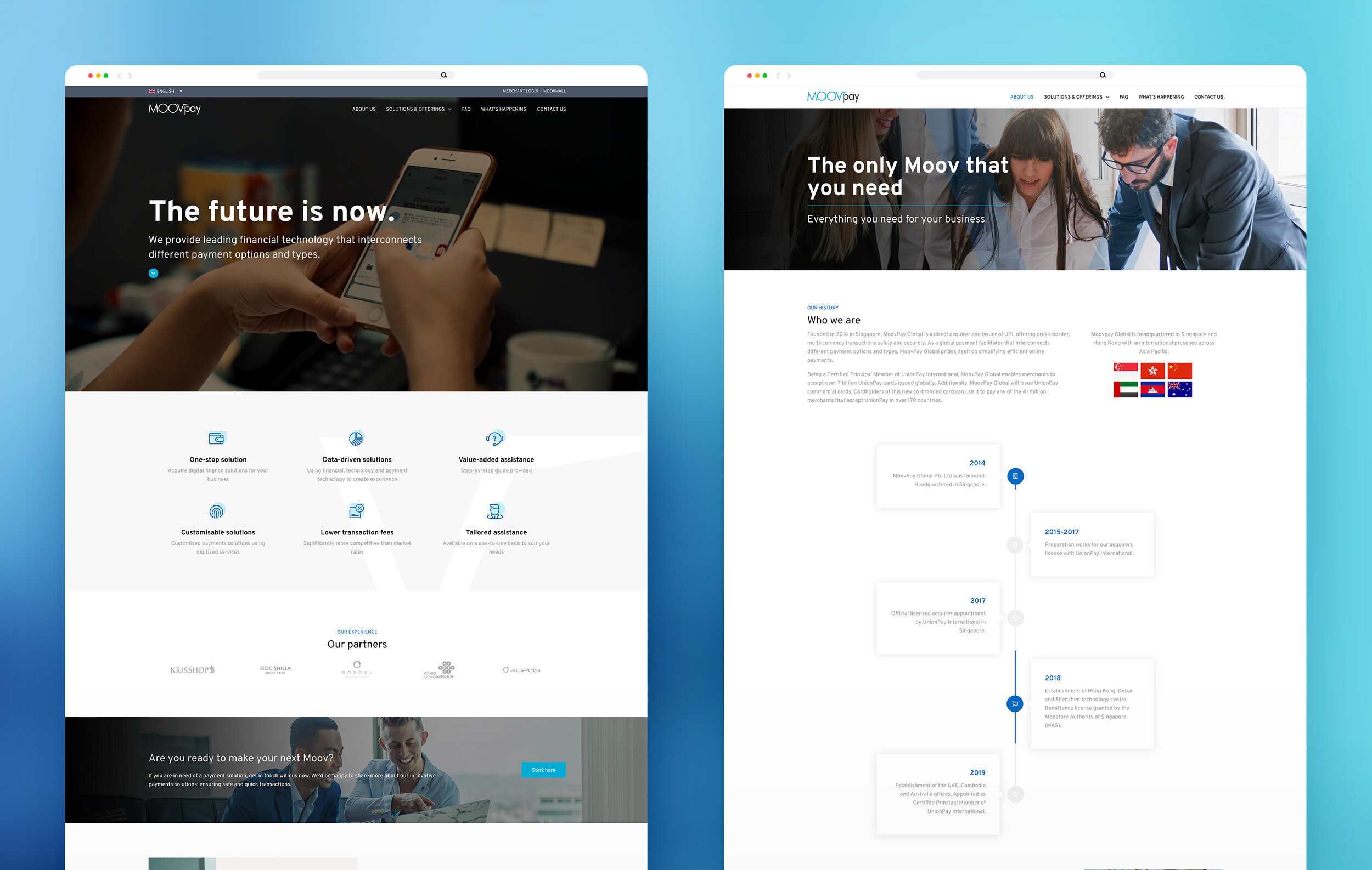
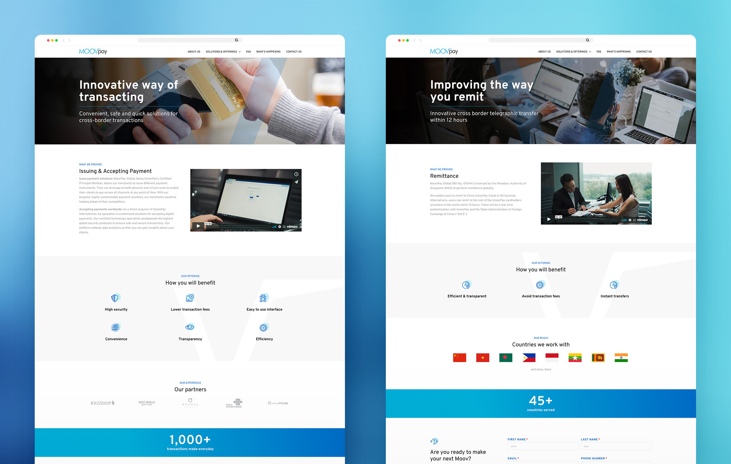
MoovPay is a global payment facilitator that interconnects different payment options and types, and prides itself on simplifying efficient online payments. Headquartered in Singapore & Hong Kong, MoovPay also has offices in Australia, Cambodia, China and the UAE.
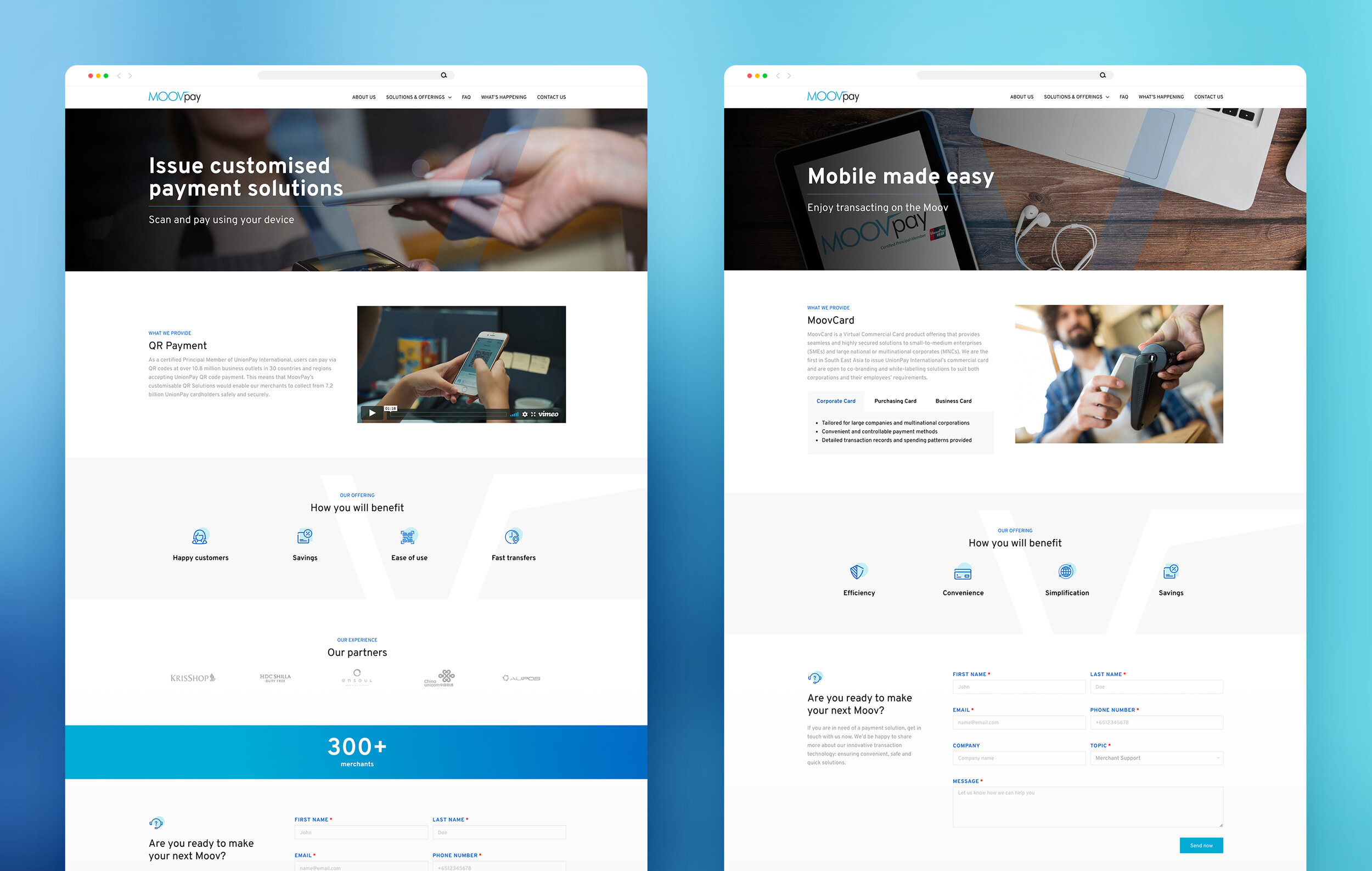
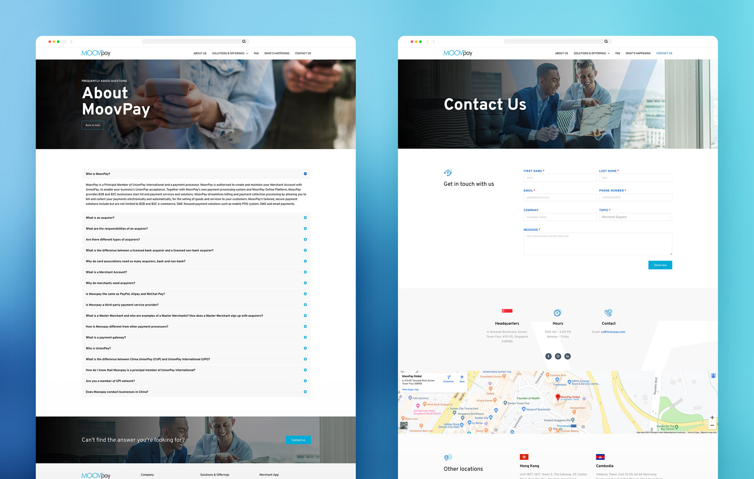
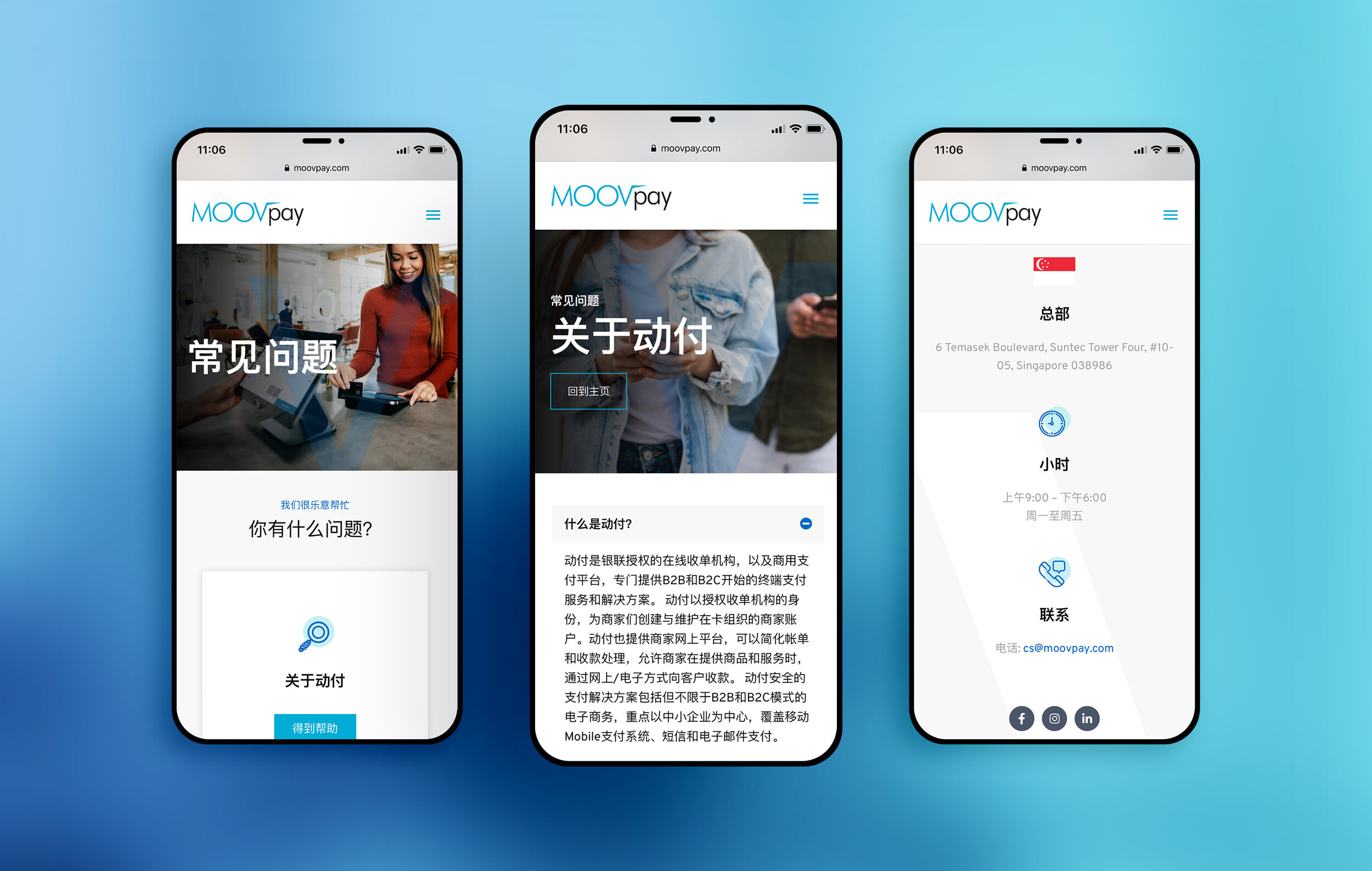
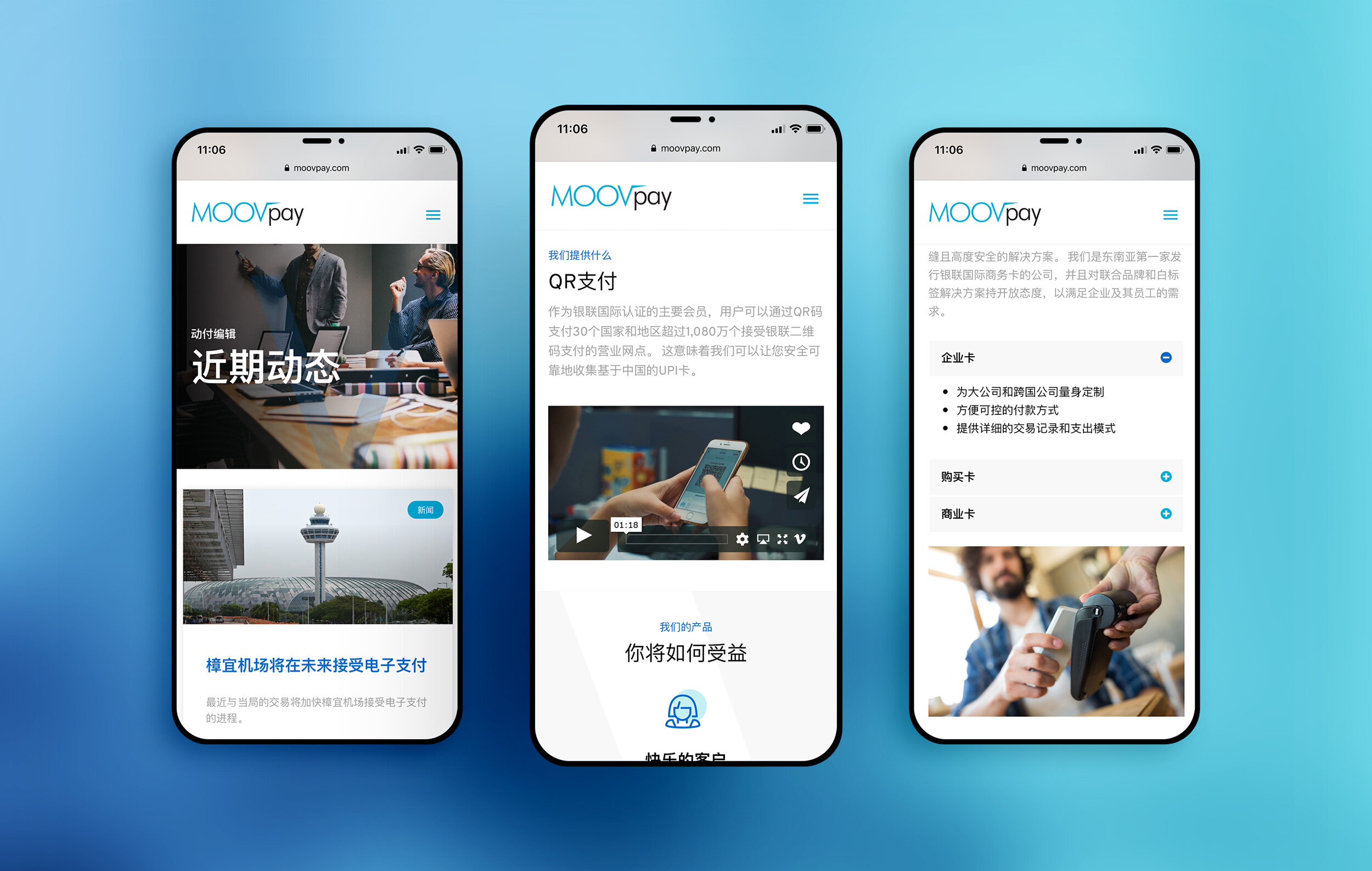
Studio Giraffe was tasked with designing and building a new dual-language website for MoovPay to reflect the personality of the brand and provide a better user experience.
OVERVIEW
SCOPE
Fully custom website designed and built on WordPress
Creation of a visual language for the brand (icon style, typography and imagery treatment)
OBJECTIVES
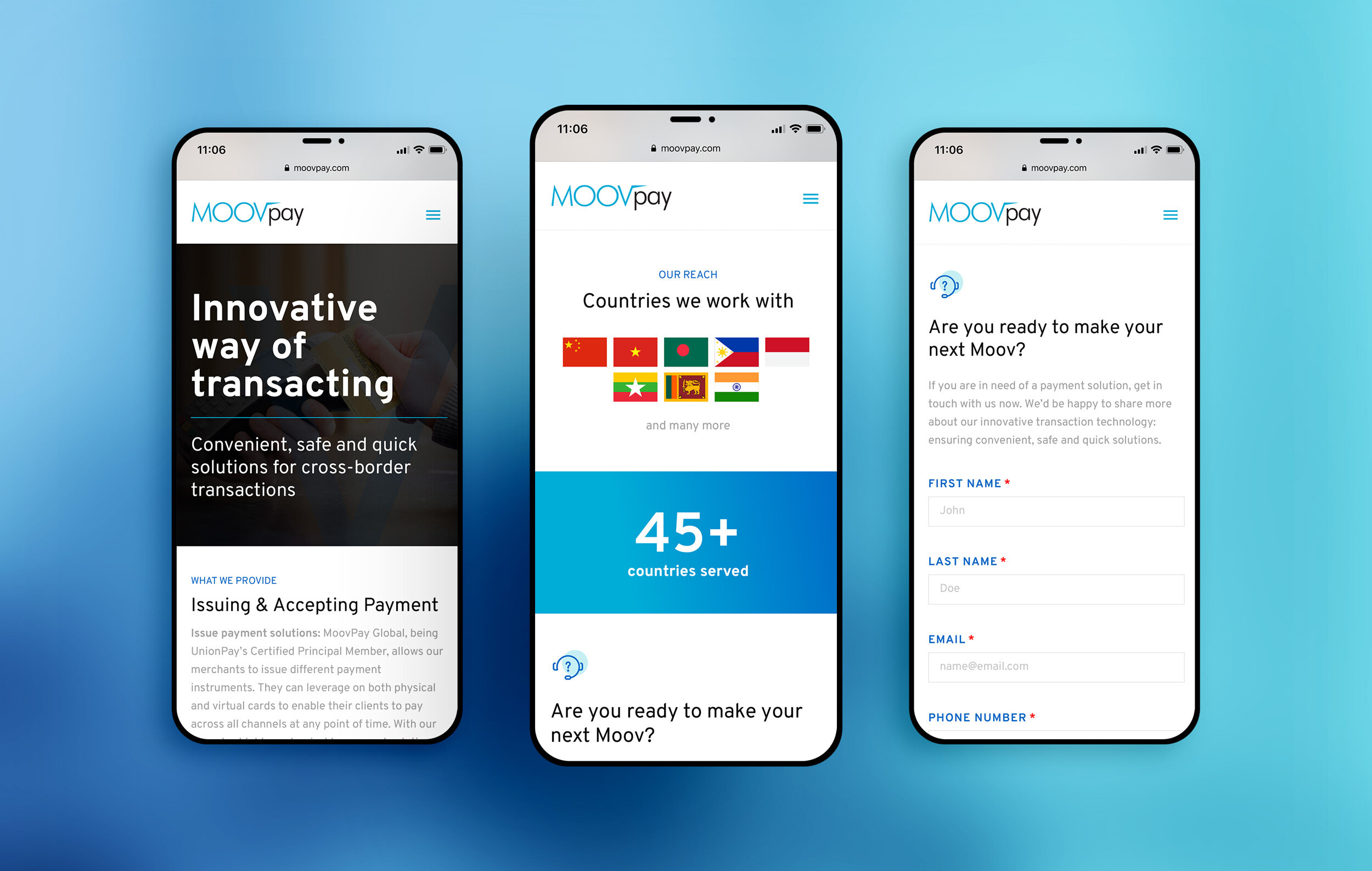
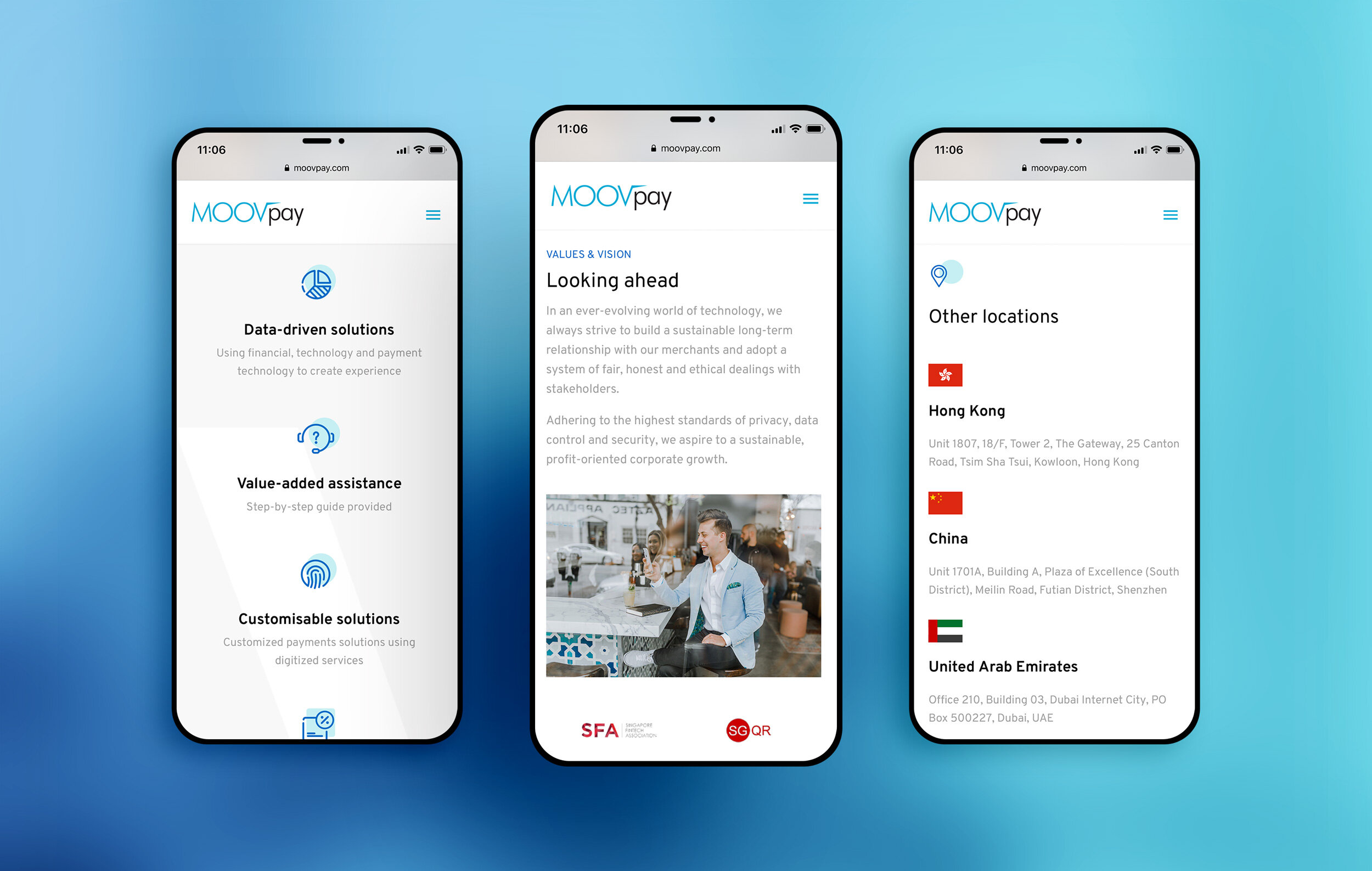
Provide an improved and consistent user experience across all devices.
Ensure clarity in conveying the various solutions provided by the company.
Identify and apply a suitable look and feel for a fast-moving fintech organisation.
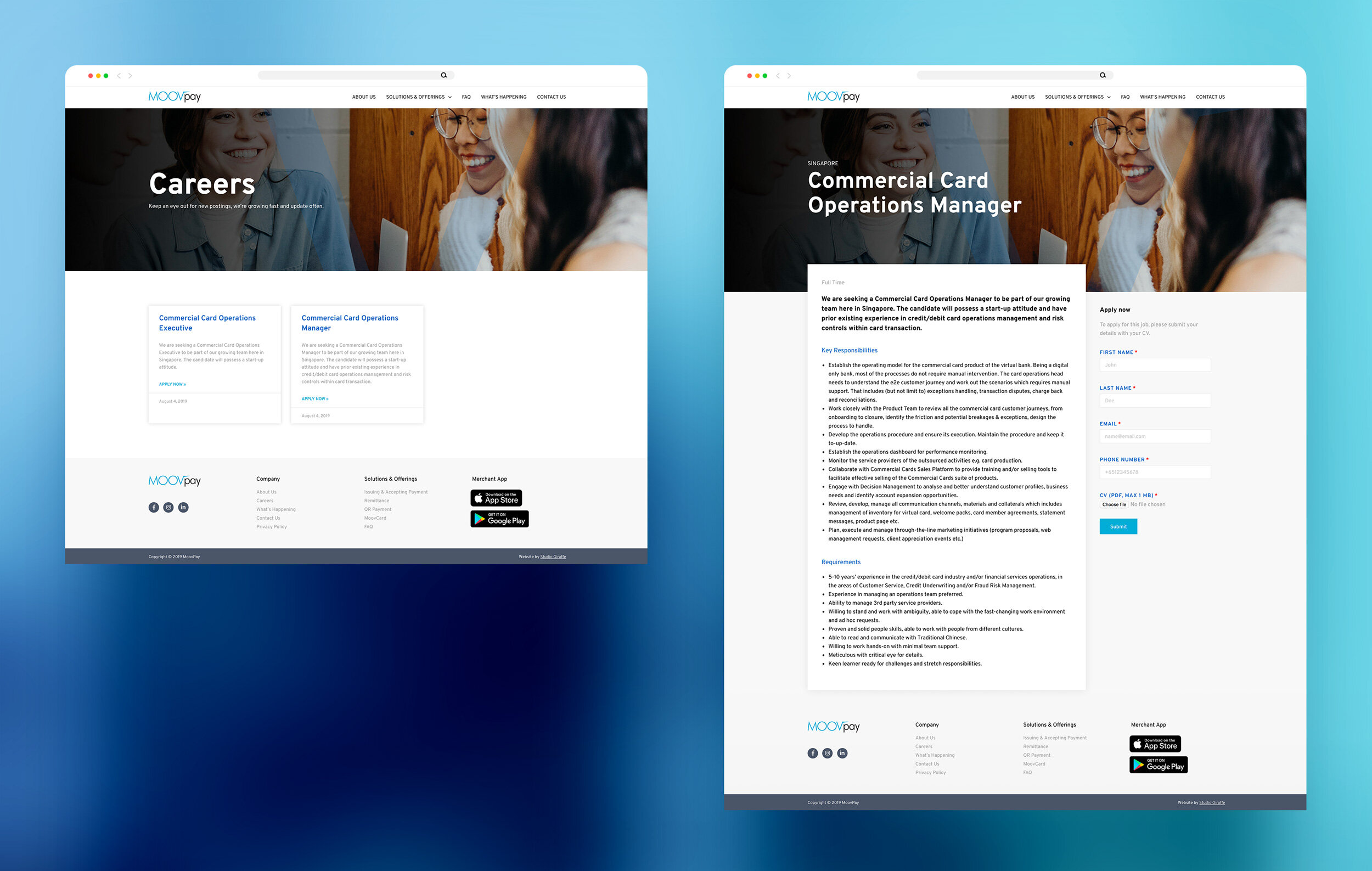
Integrate a careers section where applicants can read about open positions and apply for them.
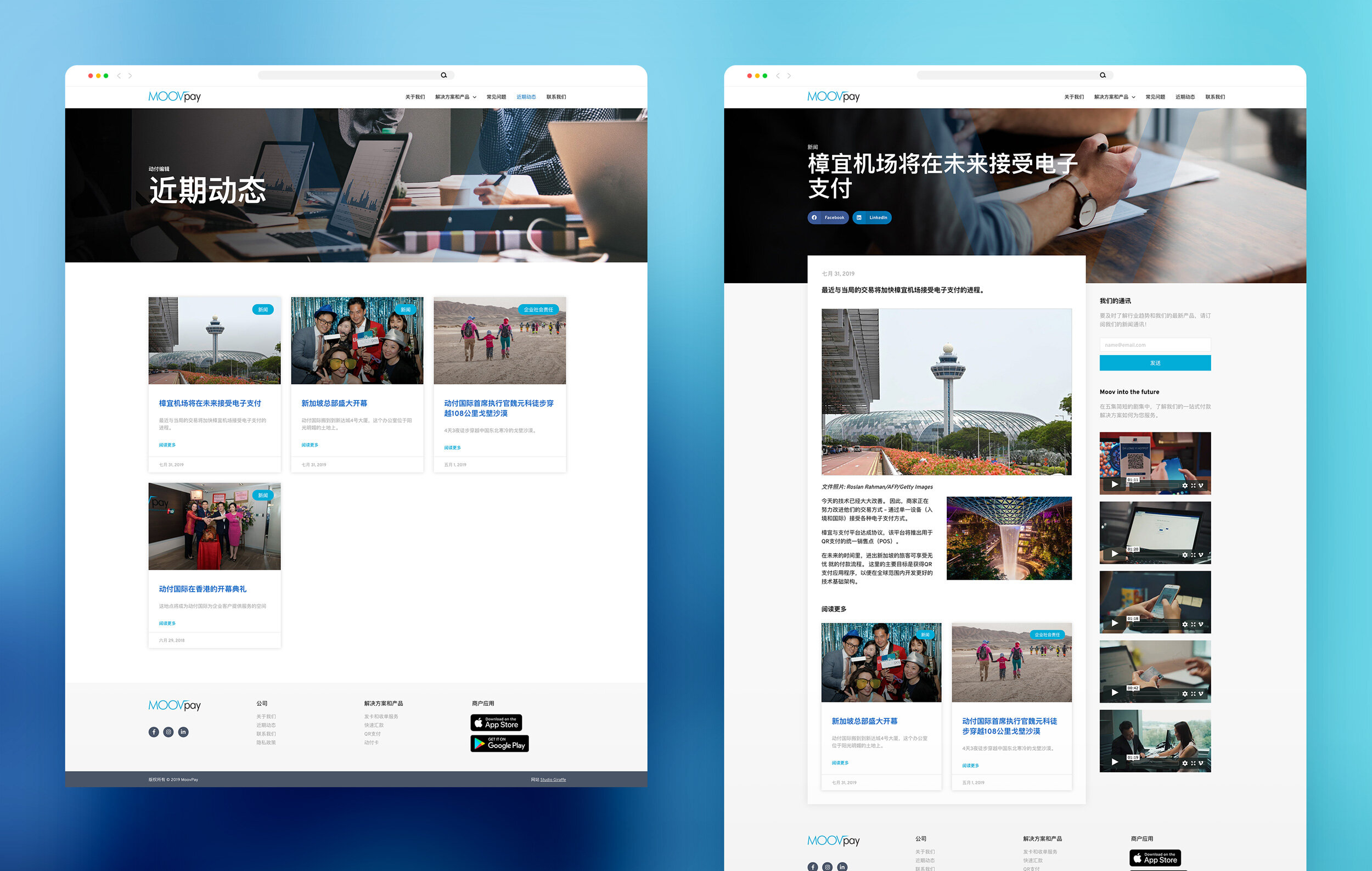
Integrate a blog section to feature the latest events, news and CSR updates from the team.
Integrate translation functionality between English and Simplified Chinese.
Integrate website analytics tracker, smart banner for app downloads and email subscriber sign up functionality.
SOLUTION
A fully responsive website was created using best practices for web, resulting in the average session duration of site users doubling compared to the old website. The average page load time was also improved by 70% compared to the old website.
A visual language was defined using the existing brand colours as a base, but giving them a more modern feel with playful icons, professional photography and a versatile typeface.
The website was built on WordPress and the client was given a briefing to enable them to independently manage the website content in case of future updates.
